What is LEX?
⭐ Lex is a platform for queer people to connect and find more community, friends and lovers near them.
This platform was created to be a welcoming space for conversation and expression—where LGBTQ+ people can build relationships, have fun, and belong.
Year: 2023
Role: UX/UI Designer & Researcher
Client: Self
Applications Used: Figma
*I do not work for Lex, and the designs expressed in my case study are strictly my own.
Problem
👉🏾 Lex is an app tailored for the queer community. However, numerous users have voiced concerns about the use of inappropriate content within the app and lack of interactional functions.
The app's community-building features are lacking, which can make it challenging for users to establish meaningful connections.
App is not very visually pleasing, There is an over powering use of green.
There is a lack of security and verification on the app.
Solutions
💡 I designed a community section where users can post events and join communities that they feel most comfortable with. Making it more interactive and community focused.
Add moderation to the community platform to improve safety
Improve information hierarchy and make content design on the app more concise
Add more community centered features
Process:
Research informed User Journey Map:
In my research involving 7 users aged 24-27, the app serves purposes like connecting friends, romantic partners, and communities, along with event planning. The existing user interface (UI) is straightforward, mainly used for scrolling, liking, and replying to posts, lacking interactive features. Major concerns include inadequate supervision leading to spam bots, scams, and explicit content. Users desire improved connection-building features and enhanced community engagement within the app.
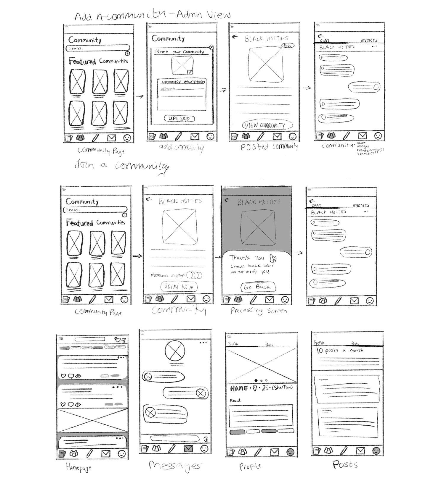
Earlier Sketches
Streamline content design
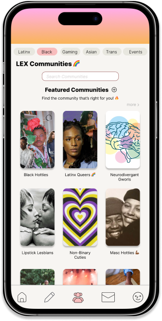
Added community centered features to bring users together
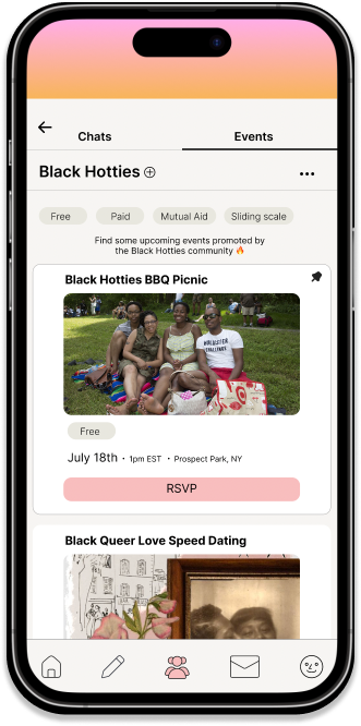
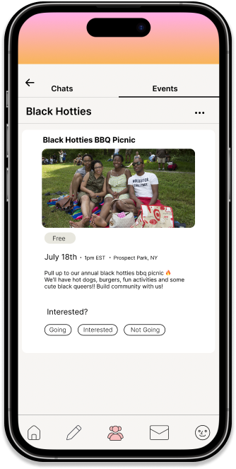
Members can access events exclusive to their community
There are verification processes that help users on the platform to feel safer
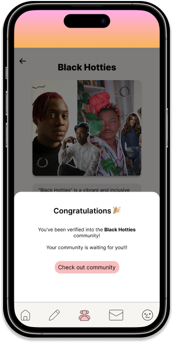
Added a verification process to onboarding
Improved Functions:
👤Changes to Profile
Name, pronouns, age, location shifted under image. Original design created accessibility issue
info sections have been reduced to one about me section
community sections tags have been added to profiles
📄Changes to feed
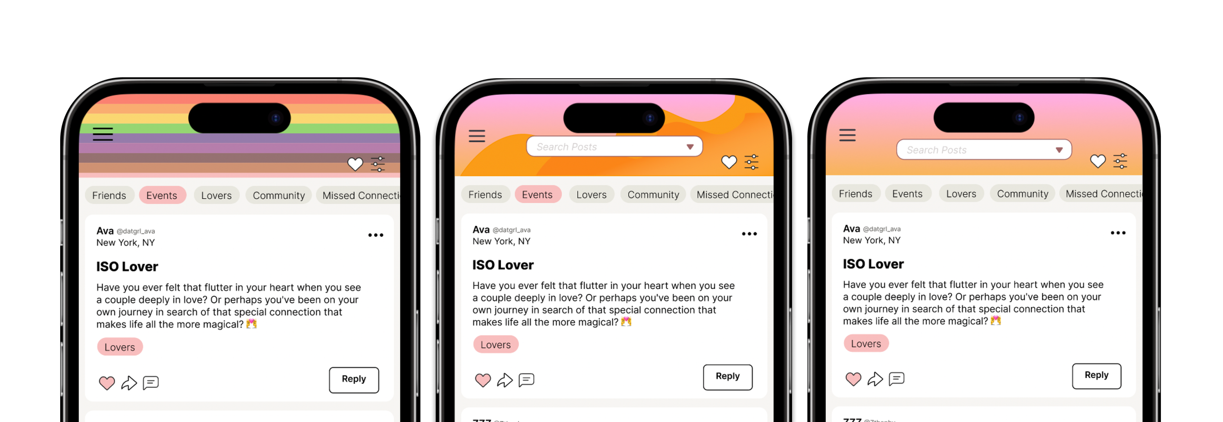
Banner color change from green to pink and orange gradient that establish warmth
comments added to increase conversations outside of chat
photo adding to lex text posts, can give posts more context and interactive
👥Community
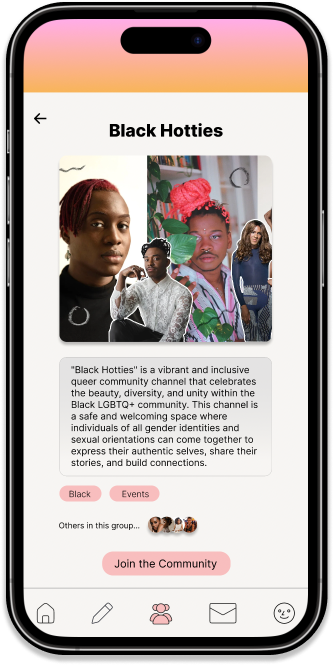
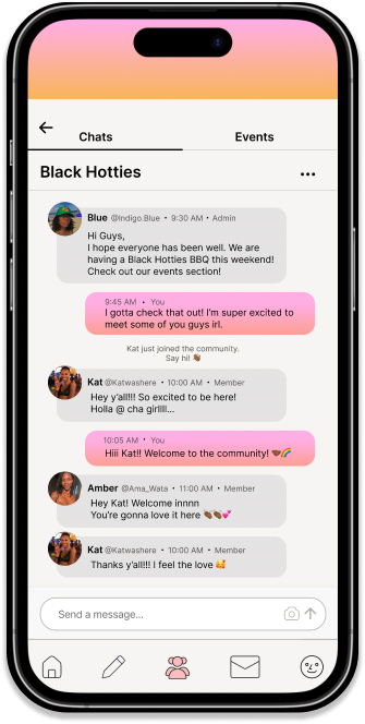
Communities on Lex are user-established groups based on identity and interests, fostering connections.
Upon creation, each community undergoes a verification process by Lex to ensure platform suitability. Users can subsequently request to join, and Lex administrators verify the request.
Communities feature group chat and event sections. Events can be categorized as free, paid, mutual aid, or sliding scale, providing users with clear expectations before signing up, with the option to pin specific events at the top of the section.
Changes and Iterations
⭐ Went with a warm gradient that represents a warmer feeling similar to a sunset that is also associated with love and nurturing.
Banner and accessibility. Banner image went through several iterations before finalizing on a gradient. First two banners were fun but caused some issues as it relates to readability and effected users who couldn’t see items on top properly.
Style Guide
This style guide fostered different icons, buttons, color schemes, UI components, and more. I utilized this through the entirety of my design to maintain the app's integrity, organization and a unified user-friendly design.
Reflection
When I started the project, I felt that everyone wanted to make the interface more interactive. As I researched, it not only confirmed this feeling but also helped me focus on creating a better community section. The research gave me good reasons for the design decisions I made and made me more confident when trying out different ideas and making prototypes.
I recognized the need for a more interactive interface, leading to a focus on improving community section.
My research confirmed the necessity for design changes, this boosted my confidence in experimenting with diverse ideas and creating prototypes.
Research-backed decisions increased confidence, enabling the exploration of varied concepts and refining prototypes for an enhanced user experience.
